Your team has poured countless hours into building a powerful, feature-rich digital product. The engineering is solid, the backend is robust, yet the business metrics aren’t meeting expectations. Engagement is low, churn is high, and the product just isn’t gaining the traction you anticipated. When this happens, the issue often isn’t the technology—it’s a foundational user experience (UX) problem.
Recognizing the symptoms of poor UX is the first step toward building a product that users not only tolerate but love. At Cardinal Peak, we’ve found that most products underperforming in key business metrics exhibit at least one of the following five signs.
Contents
5 Signs Your Product Has a Foundational UX Problem
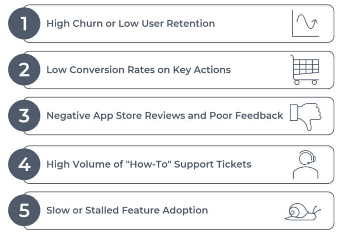
1. High Churn or Low User Retention
| The Sign | Users sign up but leave after a few sessions and never come back. Your monthly churn rate is higher than the industry average, and you’re constantly fighting to replace lost users. |
| What It Means | This is a classic sign of a “leaky bucket.” The initial promise of your product may be strong, but the actual experience fails to deliver value. A confusing onboarding process, a hard-to-find core feature, or a frustrating workflow can quickly convince users that your product isn’t worth their time. |
| How to Start Fixing It | This is where user experience consulting is critical. Begin with user exit surveys and interviews to understand why users are leaving. A comprehensive UX audit can then map out the user journey and pinpoint the exact points of friction that are causing users to drop off. |
2. Low Conversion Rates on Key Actions
| The Sign | You have steady traffic, but very few users are taking the most important actions—like completing a purchase, filling out a contact form, or upgrading to a premium tier. |
| What It Means | A low conversion rate is a direct indicator of a usability problem. There is something in the workflow—unclear navigation, a confusing form, or a lack of trust signals—that is creating a barrier between your user and the action you want them to take. |
| How to Start Fixing It | Start with a focused analysis of the specific workflow. Professional UX design services can employ tools like usability testing and heatmaps to observe real users interacting with the page. This data will reveal where they get stuck, confused, or frustrated, providing a clear roadmap for improvements. |
3. Negative App Store Reviews and Poor Feedback
| The Sign | Your customer feedback channels are filled with comments like “I can’t figure out how to…” or “This is so confusing.” Your app store ratings are stuck at a mediocre 3-star average. |
| What It Means | Your users are giving you free, unfiltered feedback. While some comments may be about bugs, a consistent theme of confusion or difficulty points to a foundational UX issue. They are telling you that the product’s mental model does not match their own. |
| How to Start Fixing It | Don’t just read the reviews—categorize them. Look for patterns related to specific features or workflows. This qualitative data is the perfect starting point for more formal usability testing, a core offering of any experienced UX design company. |
Check out this case study where we helped our client struggling with a 2.8-star rating for their IoT mobile app.
4. High Volume of “How-To” Support Tickets
| The Sign | Your customer support team is overwhelmed with tickets asking for basic instructions on how to use the product’s core features. |
| What It Means | Your product’s interface is not intuitive enough to be self-service. If users have to ask for directions, the design is not doing its job. This not only creates a frustrating experience for the user but also drives up your operational support costs. |
| How to Start Fixing It | A detailed analysis of your support ticket data can provide an instant UX to-do list. The most common “how-to” questions point to the most confusing parts of your interface. This is a clear signal to engage UX development services to redesign these workflows for clarity. |
Recognize these symptoms in your product? Our team specializes in comprehensive UX audits to pinpoint and solve these exact problems. Contact us to learn more.
5. Slow or Stalled Feature Adoption
| The Sign | You launch a powerful new feature that you expect users will love, but weeks later, the usage metrics are flat. |
| What It Means | This can be a problem of discovery or usability. Either users can’t find the new feature, or once they do, they don’t understand how to use it or why it’s valuable. The feature may be perfectly engineered, but a poor UX has rendered it invisible or unusable. |
| How to Start Fixing It | Begin by evaluating the user flow required to access and use the feature. Is it buried in menus? Is the value proposition clear? Targeted usability testing on the new feature can quickly reveal the source of the problem. |
Conclusion: From Diagnosis to Cure
If any of these signs sound familiar, don’t be discouraged. They are fixable problems, and identifying them is the first step. The key is to move from guessing what’s wrong to using a structured, evidence-based approach to find out. Partnering with an expert team like Cardinal Peak can provide the clarity and a prioritized action plan needed to turn your product’s weaknesses into strengths, creating an experience that drives retention, conversion, and growth.
Ready to diagnose your product’s UX? Schedule a consultation with our team to get a clear, prioritized action plan.
Check out these blog posts if you’re curious when is the right time for usability testing and the top 5 usability issues we encounter.